I think a lot of games curators will have spent today thinking about this post by Nathalie Lawhead, in which Lawhead recounts a recent experience of showing her game Everything is going to be OK at an event. The experience as she tells it has positive elements but was overall pretty stressful, with a lot of moments where players performed youtube-style “what is this WEIRD GAME” baffled screaming. Her experience was clearly not the best; Lawhead’s game is in some ways inaccessible and it rejects many of the conventions that make games easy to grasp in a crowded expo or exhibition environment. She writes:
I feel like, if you show games like this to total consumers audience, you have to prepare the audience for it. The setting and context has to be differentiated. You HAVE to create a space that basically screams “THESE ARE ART DON’T EXPECT A TRADITIONAL GAME”. You have to make some kind of point that people have to be open minded. Create a space that encourages respect.
The post also mentions a few examples of events that have managed to cultivate this sort of atmosphere successfully, specifically Indiecade and a space within Screenshake curated by Klondike. Most visitors to Indiecade and Screenshake don’t have the expectation that they’ll encounter primarily traditional games, so it’s a little easier for these events to combat the assumption that any given game will have (for example) a score or a traditional narrative or consistent controls or a one-sentence elevator pitch; but it’s clear that giving games room to breathe and be understood is still a challenge.
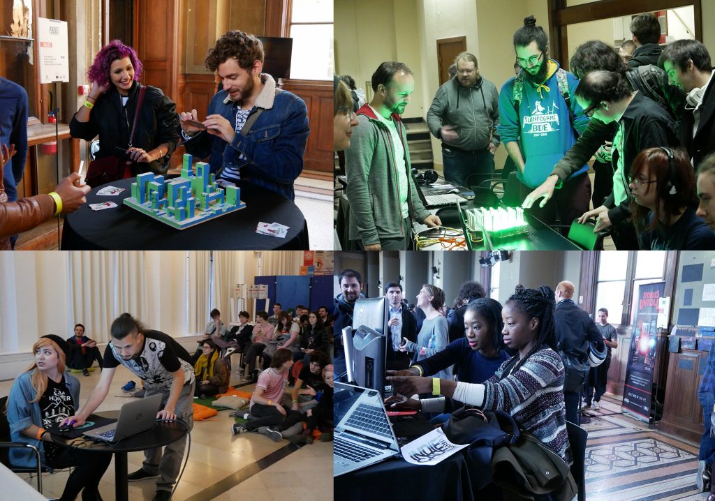
The games festival we run with Jo Summers and George Buckenham, Now Play This, is in Somerset House, which is traditionally an arts space. The rooms have high ceilings with curlicues, and big windows, and they’re small, with four or five games in each one. The signs are consistent between games; we have placards explaining how to play and giving background about the games, with no pop stands or business cards in sight. On the face of it this should be a pretty easy place to show experimental work. And yet even within this context, it can be a real challenge to make space for games that require a long time to come to terms with, or which have challenging subject matter, or which deliberately reject clarity of interaction. A lot of times we’ve failed, and we’ve shown a game and not quite done it justice.
I thought it might be interesting to write a little bit about what we’ve done to try to respond to these difficult games – by which I mean difficult to show, not difficult to play – what’s worked, what hasn’t, what we still want to try out. And if anyone has any other suggestions or things they’ve tried that worked, or didn’t, let me know and I’ll add them to the list.
THINGS THAT DIDN’T WORK AS WE’D HOPED
- Putting games near bean bags in a room that was otherwise well-lit and busy, hoping that people would get the idea that they were welcome to sit down and engage more slowly
- Filling a space with books and text-heavy games and labelling it The Library, trying to communicate an intended mode of interaction but not backing it up with atmosphere and layout
- Putting estimated play times on placards, and giving more challenging games a longer playtime in the hope that people would be willing to put in more initial effort for their payoff
- Trying to “soak up” players with some boisterous multiplayer games, so that there would be space for people to dedicate attention to nearby quieter or single-player games; when an event’s busy, crowds just attract more crowds, so at busy times the more delicate games would get drowned out
- Putting headphones on games that weren’t totally sound-dependent; people would just play without putting the headphones on (though games where the sound was vital to play fared a lot better)
THINGS THAT WORKED BETTER
- Putting a game in a tent, creating its own distinct space
- Putting books and torches inside a room-filling paper cave (designed and built by Ra’eesah Hassan) to create a distinct, darker, private-feeling area
- Thinking about seating and how to match it up to different games – there’s a real difference in how people will respond to games where they play while standing, games where they can perch casually on a stool or bench, and games that invite a conscious “draw out this chair and sit down at it properly”
- Just making a room dark, which as Lawhead notes can encourage hush and careful movement
- Facing a game into the room, so that the player has their back to a wall – this means there’s nobody overlooking the player’s shoulder to perform bafflement to, and no queue forming behind to hurry them along
- Putting games in a room with books and pictures and other static objects, to encourage a different mode of looking
- Displaying a game with relevant artefacts – illustrations from the design process, for example, or images generated from within the game, or clues to different ways to interact with the game – which gives people a different way to engage but also helps to focus attention on the game
- Clustering together games that don’t necessarily have the same themes or mechanics, but which reward similar types of attention – some rooms that we thought worked well this year included the Ten Second Room, which tried to show the range and depth of experience you can have with a game in only ten seconds; and the Study, with big wooden desks that encouraged people to sit down and put a bit of effort into playing some more enigmatic games
- Giving a game that could inhabit the space well and support a few players at once a room to itself (Aïda Gomez’s room-sized wordsearch Joy Is Here, P.D. Warne’s light-and-shadows tabletop game Larklamp)
- Banning business cards and postcards and pop-stands and mailing list signups, and anything that makes the event feel like marketing
- Discouraging artists from hanging around visibly near their game, which can be off-putting to visitors who don’t want to feel pressured to play, and often isn’t useful for the artists
EFFECTIVE STRATEGIES WE’VE SEEN ELSEWHERE
- Curtaining off a tiny one-person section of a room, making a private space with no sense of limited time or pressure to perform (at Beta Public)
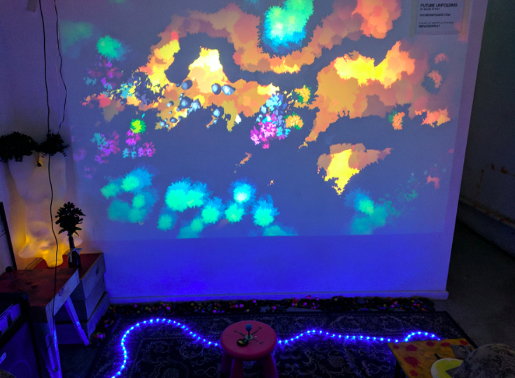
- Projecting a single-player game really huge on a wall, so attention is on the game and not on the player (at the Mixed Reality Pop-Up Arcade at SFMoma)
- Creating installations with a temporary, handmade aesthetic, crates and pieces of wood and buttons that reject the commercial framing of trad games events (BarSK in Melbourne).
- Having very few games in a space, at which point there’s no chance that everyone can play at once, and people will talk and watch and then give a game a real effort when it’s their turn (at No Quarter)
- Promoting the artists rather than the games (No Quarter again, and Fantastic Arcade seems to do something similar with its commissions though I haven’t been in person)
- Working with a theme and a location for an event that encourage a particular mode of engagement (WordPlay at the British Library, with single seats in front of games, and huge towers of books in the background)
- Having a space where people can sign up to show whatever games they like, which allows more work to be included in the event while also directing more concentrated attention onto the formal selections (AMAZE)
- Curating talks to run alongside that provide a different access point onto an artist’s work (AMAZE again, among other events)
- Creating a space very separate from the world at large, that takes effort to get to, with a longer duration that encourages attention to the work and discussion between visitors (Feral Vector)
- Theming a whole area around a game, installations and decoration and all, so the space itself acts as an extra focus of attention (at Wild Rumpus)
- Doing whatever is possible to make it clear that a space within a commercial expo area is different – something like the Leftfield Collection at Rezzed and EGX, or Alt.Ctrl.GDC at GDC, both of which are immediately visibly distinct from their surroundings. Leftfield in particular clusters unusual games together with hand-drawn signs or shifts in lighting, or it places weird physical games near the “entrance” points to its space to mark a different-ness, using whatever distinctions it can manage to hew a space out of a commercial show floor and make it feel special. This is obviously a much greater challenge than creating a space from scratch – if games are surrounded by commercial work and pop-stands then it’s more difficult to push people out of that mode of engagement.
Of course it’s not possible to try out all these different techniques at once, and in fact some of them are mutually exclusive. But they all boil down to: providing the right context for a game. For us, at its simplest this might just be a placard explaining what’s exciting about a game and how it relates to other work around it – even if people don’t read the placard, the fact that it’s there helps to establish that the games have been selected for a purpose, that we believe they repay effort and attention. But beyond that, the more time and developmental focus we’ve been able to give to the physical setup of a game, the more it’s been possible to help players to approach it in a way where they will have a good experience of the game and we can communicate what we want to about it.
This recent post by Robert Yang, who is both an artist whose games are shown regularly at events and the curator of No Quarter, talks a lot about how curators working from inside games don’t tend to pay enough attention to physical layout, exhibition design, etc. As an event curator himself he’s very aware that that’s partly because it’s expensive to do this, and really time-consuming, and the more time and money we spend on the exhibition itself the fewer games we can show and the less we can pay creators. But certainly at Now Play This we’ve historically tended too far in the direction of “ahhh these games are great and the players need something to do, can’t we squeeze something else in” at the cost of being able to pay individual attention to the games that we’ve chosen. (I say “we’ve”; to be fair, I mean “I’ve”, since I’m usually the one advocating for just one more game while everyone sighs.)
That this balance – not necessarily an imbalance, because it depends on the goals of the event, but this particular weighting of “show more great stuff” versus “give more space and attention and money to the things you do show” – that this balance is common in games becomes clear when you look at games-related exhibitions by curators and organisations coming from outside the games space. Exhibitions curated by “outsiders” can sometimes seem – to people from within an experimental games space – shallow or ill-informed, but even in those cases the space that the exhibitions give to each individual game, the attention and heft they aim to imbue the play experience with, can be salutary.
But we aren’t trapped with a load of monitors and some tangled playstation controller cords for ever, as the only way to show games. We can learn from other fields and each other; we can get better at this! Robert’s piece above mentions a few standout examples of how games can be shown in a way which directs people’s attention carefully. He points for example to the Milano Games Festival, which has experimented with having people play the same game at many different computers, then discuss it afterwards; and the Oujevipo Exhibition, which has gorgeous purpose-built cabinets that players physically inhabit in different ways, giving the whole exhibition its own feel. I haven’t been able to attend either in person but clearly they both have really distinctive, compelling ways of addressing the question: how do we as games curators gather and direct people’s attention?
Every event will have its own answer, because every event is trying to accomplish subtly different things: build a community, show a wide range of experimental work, give an idea of the whole sweep of what’s going on in games at the moment, create a party atmosphere, focus on a particular artist or theme. And each event is funded in a different way, and has to accommodate a different number of players, work within a different space. But it’s exciting to see really practical issues of games curation getting discussed more widely; and to see games events talked about as creative endeavours in their own right, rather than just a string from which to hang the chosen games.
